Ecommerce Email Open Rates: Benchmarks for Shopify Flows
/

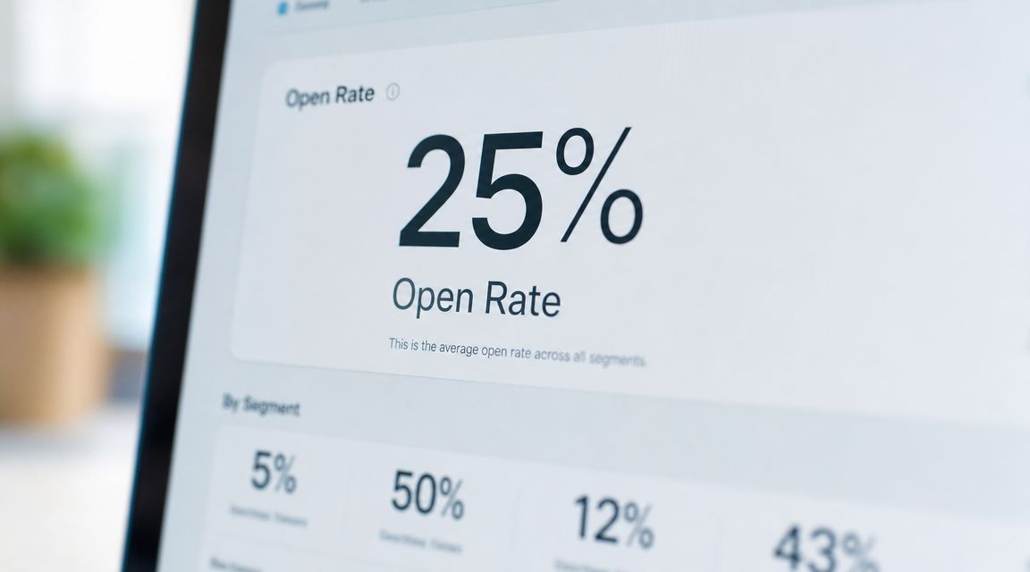
The most common advice on ecommerce email open rates is also the least useful. Teams fixate on one blended number, compare it to a benchmark they found in a blog post, and then make flow decisions from a metric that masks deeper issues.
That's a mistake for Shopify operators. A list-wide open rate mixes high-intent automations with low-intent campaigns, mixes healthy segments with stale ones, and treats Apple Mail opens like real engagement. The result is false confidence when the number looks high, and bad diagnosis when it looks low.
Table of Contents
Why List-Wide Open Rate Benchmarks Mislead
The benchmark range is the warning sign
The better way to read open rate
Welcome Flow Benchmarks
Why welcome opens usually hold up
Welcome Flow Benchmarks 3-5 Email Series
Abandon Flow Benchmarks Cart Checkout Browse
Intent strength changes by flow
Abandonment Flow Benchmarks
Post-Purchase Benchmarks
Expected emails need a different benchmark lens
Post-Purchase Flow Benchmarks
Win-Back Benchmarks
Why win-back still works
Win-Back Flow Benchmarks
Apple Mail Privacy and What It Broke
What changed operationally
What this breaks in reporting
What to Track Instead of Open Rate
The KPI stack that matters
How operators should use open rate now
Why List-Wide Open Rate Benchmarks Mislead
A blended benchmark sounds clean. It isn't.
Mailchimp's long-running benchmark data puts ecommerce at 29.81% open rate and the overall average at 35.63%, while the same benchmark discussion notes that another common benchmark range for a “good” rate sits between 17% and 28%. That spread is the point. There is no single good number that travels cleanly across flows, segments, and send types (Mailchimp email marketing benchmarks).
The benchmark range is the warning sign
If one operator is looking at a broad ecommerce benchmark near 29.81% and another is using a “good” range of 17% to 28%, both can think they're doing fine while hiding very different problems.
A weekly promo calendar can drag down the same account that has a strong welcome flow. A stale segment can sit inside the same dashboard as a healthy recent-buyer audience. One sender can look “average” while checkout abandonment is weak and post-purchase is carrying the whole program.
Practical rule: Don't compare your entire email program to one benchmark. Compare each flow to the intent behind that flow.
Operators working across both DTC and wholesale already know this pattern from adjacent channels. Teams that run structured email marketing for B2B don't judge nurture, outbound, and lifecycle mail by one blended open rate either. Ecommerce shouldn't.
The better way to read open rate
Open rate still has a job. It's useful as an early signal for subject line quality, sender recognition, audience fatigue, and segment fit. Salesforce's benchmark definition matters here because open rate is based on the share of delivered emails that were opened. That makes it a top-of-funnel inbox signal, not a business outcome.
For Shopify teams, the practical move is to treat the program like a portfolio:
Welcome flow should beat campaign traffic because intent is fresh.
Abandon flows should beat welcome on urgency when the trigger is strong.
Post-purchase should hold unusually high opens because the customer expects the message.
Win-back should be judged by reactivation quality, not by whether it matches a welcome series.
A store sending broad campaigns at one level and behavior-triggered emails at another isn't “inconsistent.” It's behaving normally.
Welcome Flow Benchmarks
Welcome flow open rate can look great and still hide a weak series.
This flow gets judged too often on inbox attention alone. The better read is whether the first few emails turn fresh intent into site traffic, first-order conversion, and revenue per send. High opens with soft clicks usually mean the signup promise, offer, or message order is off.
Why welcome opens usually hold up
A subscriber who joined 5 minutes ago still remembers why they gave you an email address. That gives welcome a structural advantage over batch campaigns, but it does not guarantee performance. Source quality matters. So does send timing. A popup subscriber chasing a discount, a quiz subscriber looking for guidance, and a checkout subscriber expecting order-related communication should not receive the same sequence and be measured the same way.
That is also why list-wide open benchmarks are weak planning tools here. Welcome should outperform broad campaigns on opens in a healthy account. The more useful question is whether it also pulls its weight on click-through rate and revenue per send.
Welcome Flow Benchmarks 3-5 Email Series
Metric | Average Performance | Top 10% Performance |
|---|---|---|
Open rate | Above regular campaign performance | Among the strongest flows in the account |
CTR | Should clearly outperform broad campaigns | Strong enough to justify iterative testing across message order and offer framing |
Revenue | Usually one of the most important automated revenue drivers | Can rival or exceed other core lifecycle flows depending on offer and list source |
The operators who get the most from welcome flows review the series by entry source first, then by email position. Email 1 often carries the highest opens, but email 2 or 3 may carry more selling weight if the first message is doing brand and expectation-setting work. If clicks collapse after the first send, the problem is often not subject lines. It is weak sequencing.
A practical setup looks like this:
Email 1: deliver the signup promise fast. Discount, education, quiz result, or category path.
Email 2: reduce decision friction with proof, bestsellers, use cases, or category guidance.
Email 3 to 5: handle objections, reinforce the offer if one exists, and move the shopper toward a first purchase.
For stores tuning lifecycle against recovery performance, it helps to compare welcome against downstream intent flows using a Shopify abandoned cart recovery benchmark breakdown. The point is not that welcome should beat cart recovery on every metric. The point is that welcome usually has more volume, so even modest gains in CTR or revenue per send can create outsized revenue.
Creative matters here, but message continuity matters more. If the form promises expert picks and the first email is a generic discount blast, opens may stay healthy while clicks and conversion lag. That is a positioning problem.
For operators looking at actual sequence structure and offer presentation, the Rebus guide to email recovery is useful as a contrast point. Recovery emails win on urgency. Welcome emails win by matching the reason the subscriber signed up and guiding the first purchase without wasting the first touch.
Welcome flows usually underperform for one of three reasons: low-intent acquisition sources, a first email that misses the signup promise, or a sequence that asks for the sale before building enough product confidence.
Abandon Flow Benchmarks Cart Checkout Browse
Abandonment benchmarks only make sense if you separate the shopper by intent. A browse abandon email is trying to restart consideration. A cart email is trying to resolve hesitation. A checkout email is trying to remove the last bit of friction and get the order over the line.
Treating those as one benchmark bucket hides the part that matters most. Revenue does not come from open rate alone. It comes from how much purchase intent already exists, how fast the message goes out, and how easy it is to return to the exact step the shopper left.
Intent strength changes by flow
Browse abandon sits at the top of the funnel inside your lifecycle program. The shopper showed interest, but not enough to start checkout. That usually means lower revenue per send and more dependence on product relevance, merchandising, and creative continuity from the session they just had.
Cart abandon is different. The shopper already made a selection, so the email has one job. Address the reason they paused. Sometimes that is shipping cost. Sometimes it is uncertainty about fit, delivery timing, or returns. Repeating the product tile and a generic reminder is rarely enough.
Checkout abandon deserves the most operational discipline. Send timing matters more here, the path back needs to be obvious, and the email should reduce friction before it adds sales pressure. Discounting too early can recover some orders, but it can also train price sensitivity in a flow that often converts without one.
Abandonment Flow Benchmarks
Flow Type | Open Rate | CTR | RPR |
|---|---|---|---|
Browse | Usually above regular campaigns if browse capture and product matching are clean | Swings hard based on relevance, category depth, and whether the email reflects the viewed product or category | Lower than cart and checkout in most programs because intent is weaker |
Cart | Stronger than browse because the shopper already created a basket | Improves when the email answers objections, highlights returns or shipping clarity, and links straight back to cart | Often one of the highest-yield lifecycle flows outside welcome |
Checkout | Commonly the strongest abandonment flow for both clicks and recovery efficiency | Highest when the return path is direct and the message removes checkout friction | Frequently the best abandonment flow on a per-send basis |
The practical implication is simple. Browse needs better merchandising. Cart needs better objection handling. Checkout needs speed, clarity, and a low-friction route back to payment.
A lot of ecommerce teams spend too much time polishing browse creative while checkout emails stay bloated, delayed, or hard-linked to the homepage. That trade-off costs revenue. If one abandon flow gets the cleanest copy, QA, and send logic, it should be checkout.
For operators comparing sequence structure, send timing, and recovery logic, this Shopify abandoned cart recovery benchmark breakdown is a useful reference point. The Rebus guide to email recovery is also worth reviewing because it focuses on message construction, not generic reminder advice.
SMS can change the economics here, especially if inbox competition slows recovery through email. In mixed-channel programs, operator feedback around tools like Recart and SMS benchmarks helps frame whether email should carry the first recovery touch or support it.
Post-Purchase Benchmarks
Post-purchase open rates are usually inflated by intent. The customer just bought. They are looking for a receipt, shipping detail, tracking link, or return information. That makes these emails useful, but it also makes open rate a weak proxy for commercial performance.
The better question is whether post-purchase email drives the second action you want. Click to tracking. Click to account. Click to replenishment. Click to a relevant add-on. If those actions are weak, a high open rate is just confirming that the message was expected.
Expected emails need a different benchmark lens
Post-purchase splits into two distinct jobs. Transactional mail needs to deliver clarity fast. Marketing post-purchase mail needs to create the next order without getting in the way of the service message.
That distinction matters because the same open does not carry the same value.
Post-Purchase Flow Benchmarks
Flow Type | Open Rate | What to watch more closely |
|---|---|---|
Transactional post-purchase | Usually one of the highest-open email types in the program because the customer expects it | Clicks to tracking, order detail, account actions, support deflection, and inbox placement |
Marketing post-purchase | Often strong if the send is closely tied to the item purchased, timing, and reorder window | CTR, conversion rate, Revenue-per-Send, and whether the recommendation logic beats standard campaign traffic |
The operational mistake is easy to spot. Teams cram promotions into confirmation and shipping emails, then wonder why click quality drops or support tickets rise. If the customer has to work to find order information, the email failed its first job.
Keep the hierarchy clear. Service content first. Commercial content second. Cross-sell placement should match the original purchase, the delivery stage, and the likely next need.
A skincare brand can push replenishment or regimen completion. A furniture brand usually needs a longer delay and a narrower accessory recommendation. A broad "you may also like" block often gets opens and very little revenue.
That is why post-purchase should be judged flow by flow, not as one bucket. Order confirmation, shipping confirmation, review request, replenishment, and upsell all have different economics. The operators who get paid here usually optimize for Revenue-per-Send and assisted repeat purchase rate, then use opens as a diagnostic metric, not a success metric.
For teams refining cross-sell timing and product logic, this review of Shopify post-purchase upsell patterns is a useful reference.
Win-Back Benchmarks
Win-back is one of the few places where open rate can still tell a sharp story. The customer already knows the brand. The question isn't awareness. It's whether the reason to return is strong enough.
Why win-back still works
When the segment is clean and the timing is right, win-back emails can outperform standard promotional mail by a wide margin. Opensend reports that automated winback emails average 42.51% open rate, and the same benchmark summary notes that retail and shopping emails average 35.90% overall. Klaviyo's benchmark data across industries reports a 31% average open rate, with the top 10% of performers at 45.1% (Opensend ecommerce open rate benchmarks).
That matters because it shows two things at once. First, lifecycle relevance can beat broad promotion. Second, strong operators can still separate from the pack.
Win-Back Flow Benchmarks
Metric | Average Performance | Top 10% Performance |
|---|---|---|
Open rate | 42.51% average for automated win-back emails | 45.1% open rate for top performers across Klaviyo benchmark data |
CTR | Should outperform low-intent campaign traffic when the offer and segment are aligned | Strongest when the message reflects product history or lapse reason |
Revenue | Efficient when the audience still has product-market fit | Best when used surgically, not blasted to the entire dormant file |
The bad version of win-back is a blanket discount to everyone who hasn't bought recently. The better version uses product category, prior order type, replenishment logic, or a real “what changed” hook.
Apple Mail Privacy and What It Broke
Apple Mail Privacy Protection turned open rate from a rough engagement metric into a noisy one.
What changed operationally
Apple can preload email content and tracking pixels through its own systems. When that happens, the platform may register an open even if the person never opened the message in the usual human sense. For operators, that means part of the open-rate graph is now technical behavior, not audience behavior.
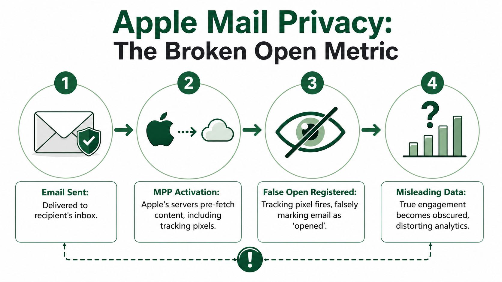
What this breaks in reporting
The biggest loss is comparability. Historical trends become messy. Segment-level open analysis becomes less trustworthy. “Did this subject line really win?” gets harder to answer when a large share of opens may be inflated.
This doesn't make open rate worthless. It makes it directional.
A serious reporting stack should treat open rate as one signal inside a wider set:
Inbox interest signal for subject line and sender-name testing
Flow health check when reviewed against clicks and conversion
Deliverability clue when paired with complaints, unsubscribes, and click decay
If opens rise while clicks, conversions, and revenue quality don't move, the program didn't suddenly get better. The metric got less honest.
This is also where teams get into trouble with resend logic, “opened but didn't click” segments, and engagement scoring that leans too heavily on opens. Apple changed the value of those automations, and many accounts still haven't adapted.
What to Track Instead of Open Rate
Open rate still belongs on the dashboard. It just doesn't belong at the top of the hierarchy.
The KPI stack that matters
A better reporting order starts with action, not visibility.
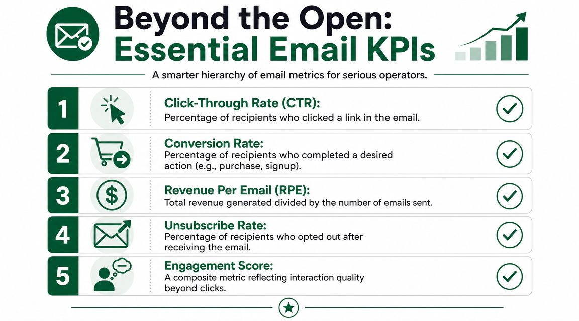
For most Shopify teams, the stack should look like this:
Conversion rate
This tells whether the flow moved someone to buy, subscribe, or complete the intended next step.Revenue per email or per recipient
This keeps operators honest. A flow with pretty open numbers and weak revenue usually has a merchandising, audience, or landing-page problem.CTR
Click-through rate shows actual movement. It's much harder to fake than open rate.Unsubscribe rate and complaint signals
These expose fatigue and mismatch. They also protect the future of the program.Open rate
Useful, but only after the metrics above.
The practical implication is simple. If a flow opens well but doesn't click, the email body or offer is weak. If it clicks but doesn't convert, the landing page or product proposition is the bottleneck. If it doesn't open, then subject line, sender identity, audience fit, and list health move to the front of the line.
How operators should use open rate now
Current guidance on improving low open rates points to the usual causes: poor list hygiene, weak content expectations, and technical setup issues. It also recommends prioritizing a highly engaged 14-day to 90-day audience when rates are weak, and modern strategy guidance stresses prioritizing a highly engaged 90-day audience while focusing on clicks and conversions so subscribers aren't trained to ignore the brand (iContact guidance on improving open rates).
That advice matters because sender fatigue is usually self-inflicted. Teams send too often to stale segments, keep broad campaign frequency high after engagement drops, and then wonder why “benchmark” performance keeps slipping.
A cleaner operating model looks like this:
Use recency first. Recent engagers should carry most campaign volume.
Judge flows by job. Welcome should convert first purchase. Post-purchase should support repeat behavior. Win-back should reactivate. Don't collapse them into one benchmark.
Review clicks beside opens. A subject line can win and still bring the wrong traffic.
Watch unsubscribes after cadence changes. Frequency increases often look fine before they don't.
For operators who also manage hybrid B2B and ecommerce motions, Breaker's guide to B2B open rates is useful because it reinforces the same lesson from another angle. Context matters more than a universal target. For app-stack decisions inside Shopify, this review of the best Shopify email marketing apps helps frame platform choice around workflow fit, not just headline metrics.
The most useful benchmark isn't a single number. It's whether each flow is doing the job it was built to do, without burning list quality to get there.
The operators who understand these trade-offs are exactly the people app founders want to hear from. app store research is a platform that connects Shopify merchants with paid product research interviews with app developers and UX teams. It's where serious operators get direct access to the founders building the tools they use, influence product roadmaps, and get early visibility into what's coming next. The incentive matters, but the bigger advantage is access and influence. For those who want that seat at the table, apply to participate in the network.

Author
Jonathan Kennedy
Jonathan Kennedy is the founder of app store research and shopexperts, platforms that connect operators, founders, and experts across the Shopify ecosystem to drive better decisions, product development, and growth.