Shopify Checkout Optimization for Plus Operators 2026
/

A scaling brand usually reaches the same point. Product pages are cleaner, paid traffic is dialed in, retention is under review, and yet conversion still feels capped. The leak sits in the last mile. Customers reach checkout, hesitate, and leave.
That's why Shopify checkout optimization matters more than another homepage tweak for serious operators. Checkout is where revenue is either captured or lost, and it's where the transition to extensibility changed the operating model. The old checkout was largely a black box. The current one is more flexible, but it still has hard boundaries.
That distinction matters if a team is auditing whether Shopify Plus is worth it, or deciding how much effort to put into custom checkout work. A lot of brands upgrade expecting total freedom, then learn the practical limits later. The better path is to treat checkout as a constrained but high-impact system. For teams evaluating that shift, this guide on when to upgrade to Shopify Plus is a useful companion.
Table of Contents
What Checkout Extensibility Actually Unlocks in 2026
Where extensibility helps
What still stays locked
Speed The Single Biggest Lever
Start with accelerated checkout
Performance debt is usually self-inflicted
Trust Signals at the Right Moment
Trust comes from cost clarity and policy clarity
Payment Method Ordering and Presence
The order matters as much as the list
Choice is useful until it becomes clutter
One Page vs Multi Step The New Evidence
Why the old debate misses the point
How to decide what to test
Custom Checkout Apps Worth Using
Use a problem-first rubric
Categories that usually justify a closer look
Measurement Checkout Funnel Analytics
A practical diagnostic workflow
What teams usually miss
Influence the Tools You Use Every Day
What Checkout Extensibility Actually Unlocks in 2026
A Shopify team migrates off checkout.liquid expecting full creative freedom, then runs into a significant boundary on day one. Checkout Extensibility gives operators more places to add logic, content, and apps, but it still keeps the core checkout controlled by Shopify. That distinction matters because it changes how serious teams should prioritize their work.
Where extensibility helps
The gain is targeted control. Operators can add checkout UI components for delivery messaging, return policy reminders, address guidance, loyalty prompts, custom fields that support actual operations, and post-purchase offers that fit margin and fulfillment constraints. That is a meaningful step up from the old pattern of fragile scripts and one-off workarounds.
It also changes how checkout apps should be judged. The bar is higher now. An app is sitting on the conversion path, so it has to justify its effect on load, clarity, and support overhead. Shopify's app ecosystem has matured around the new framework, but more choice has created a second problem. Teams now have more ways to clutter checkout while telling themselves they are optimizing it.
I have seen the best results come from narrow use cases with a clear operational payoff. Examples include delivery estimate messaging for high-anxiety purchases, address validation for stores with expensive shipping errors, and post-purchase offers where average order value can rise without adding friction before payment.
What still stays locked
The constraints are still the strategy.
Shopify does not hand over full control of payment flow, shipping logic, or the underlying checkout architecture. That is intentional. Compliance, reliability, and upgrade safety matter more than giving every brand a custom build.
Operator view: Good checkout strategy starts with the platform boundary. Teams waste time and budget when they plan around customization Shopify will not permit.
The teams that get the most value from extensibility usually share three habits:
They fix operational friction first: missing delivery context, bad address capture, weak payment reassurance, and unnecessary fields.
They treat every app block as a cost: more UI can mean more hesitation, more rendering work, and more failure points.
They work with Shopify's native flow: the strongest builds support the checkout that already converts instead of trying to redesign it from scratch.
That is the practical state of Shopify checkout optimization in 2026. Extensibility gives serious operators more room to improve the parts that matter, but it does not remove the platform limits, and good teams plan accordingly.
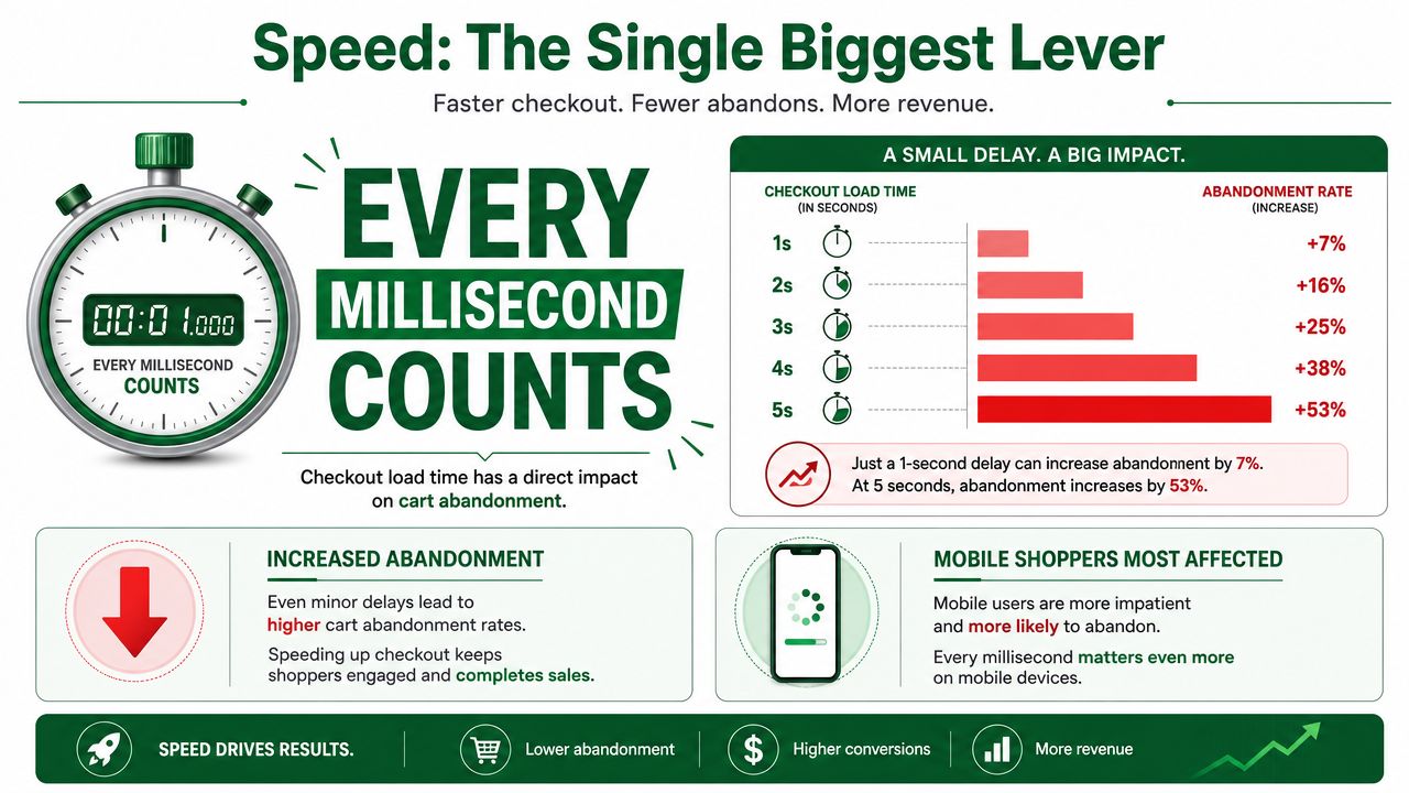
Speed The Single Biggest Lever
A shopper opens checkout on a phone with one hand, spotty reception, and no patience left. That is the environment your checkout has to win in.
Speed decides whether the rest of the experience even gets seen. Teams often spend review cycles on copy tweaks and extra blocks before they fix the parts that slow a buyer down: too many inputs, weak wallet visibility, and unnecessary extension weight. For serious operators working within Checkout Extensibility, that priority is simple. Remove effort first.
Shopify itself positions Shop Pay as a faster checkout experience than regular checkout, and that matches what operators see in practice. Returning customers convert more easily when payment details, shipping details, and identity are already in place. On mobile, that matters even more because thumb typing is expensive.
Start with accelerated checkout
For stores with meaningful mobile traffic, accelerated payment methods usually beat almost every design debate. Shop Pay, Apple Pay, and Google Pay reduce field entry, shorten decision time, and lower the odds of a distracted customer dropping out before payment.
That does not mean every wallet deserves equal prominence in every market. Payment mix depends on device share, geography, and customer type. A US fashion brand with heavy iPhone traffic should not present payments the same way as a B2B parts seller with desktop-heavy sessions.
A practical priority order looks like this:
Put wallet options at the top of the queue: enable Shop Pay, Apple Pay, and Google Pay before adding another checkout app block.
Audit the mobile interaction model: large tap targets, clear primary actions, and short form flows remove friction fast.
Treat address capture as an operations problem: autocomplete and validation reduce both customer effort and downstream shipping errors.
Keep persuasion out of the critical path: if review content is useful, use it selectively and base it on what is relevant to checkout. This breakdown of Shopify review apps in 2026 is more relevant than copying product page tactics into payment.
Performance debt is usually self-inflicted
Shopify's base checkout is rarely the thing dragging performance down. Merchants usually create the problem themselves by stacking extensions, adding visual clutter, and asking checkout to carry messages that belonged earlier in the funnel.
I have seen this pattern repeatedly after migrations to Checkout Extensibility. A team replaces old checkout.liquid customizations, gains a safer and more maintainable setup, then starts adding blocks back one by one until the page is crowded again. The platform boundary improves reliability. It does not protect you from bad prioritization.
For Plus teams, the temptation is stronger because Shopify supports up to 99 saved checkout customizations for A/B testing and experimentation on Shopify Plus. That flexibility is useful, but it also creates a common failure mode. Teams test too many ideas that add interface weight without removing any real friction.
Use a stricter standard. Every checkout element should justify its existence in one sentence: it speeds completion, reduces confusion, or improves payment capture. If it does none of those, it probably belongs somewhere else.
Trust Signals at the Right Moment
A customer gets to checkout ready to pay, then sees shipping, tax, or delivery terms that were not clear earlier. That is the moment trust breaks. The problem is rarely a missing security badge. It is the feeling that the offer changed at the last second.
Baymard Institute found that extra costs such as shipping, taxes, and fees are a leading reason people abandon checkout, with 48% of US online shoppers citing them in its cart abandonment research: Baymard Institute cart abandonment rate statistics. The same Baymard research also reports an average documented online shopping cart abandonment rate of 70.19%.
For operators on Shopify, the practical takeaway is simple. Use checkout to confirm the deal, not introduce new terms. Checkout Extensibility gives teams more controlled ways to place helpful information, but it does not remove the underlying constraint. If key reassurance shows up too late, conversion still drops.
Trust comes from cost clarity and policy clarity
A polished checkout can still create doubt. Customers notice gaps fast. If the item total looked straightforward on the product page and the final payable amount jumps at checkout, many buyers assume there is more friction coming.
The trust signals that usually help are quiet and specific:
Total cost visibility: make shipping expectations, taxes, and any added fees clear as early as the flow allows.
Return policy access: give buyers a short path to the actual policy instead of stuffing checkout with reassurance copy.
Delivery clarity: estimated arrival windows do more work than generic shipping language.
Contact visibility: support details or a clear help path can reduce hesitation on higher-consideration purchases.
Social proof with restraint: reviews often do more work before checkout than inside it. Teams evaluating placement can use this review of Shopify review apps for 2026 to decide whether review content belongs in the funnel earlier.
I would apply a hard filter here. If a trust element does not answer a real buying question, remove it. Checkout is a bad place for brand theater.
There is also a trade-off. Some reassurance modules help on expensive or unfamiliar purchases, but every added block competes with payment completion. Plus merchants should test that balance carefully, especially when deferred payment messaging or processor-specific trust cues are in play. If the team is also reviewing payment stack trade-offs, it helps to compare braintree and stripe features before deciding which payment reassurance belongs in checkout and which belongs earlier in the journey.
Payment Method Ordering and Presence
Payment strategy is often treated like a settings page decision. It isn't. The list of available methods, and the order in which they appear, shapes whether checkout feels obvious or overloaded.
The order matters as much as the list
A serious operator usually starts with the methods most likely to reduce effort for the primary buyer. Accelerated options should usually lead because they shorten the path and feel familiar. After that, the mix should reflect customer intent, order value, and geography.
A simple decision table helps:
Checkout scenario | What to prioritize | What to avoid |
|---|---|---|
Mobile-heavy domestic traffic | Wallets and fast autofill options | Burying accelerated methods under card forms |
Higher consideration purchases | Clear card options plus relevant deferred payment methods | Forcing one payment path too early |
International mix | Local relevance and recognizable methods | Presenting a generic US-first payment stack everywhere |
Returning customer base | Saved credentials and repeatable flows | Resetting buyers into a full manual form each time |
Choice is useful until it becomes clutter
Too few options creates refusal. Too many creates hesitation.
The right number isn't universal, so the better question is whether each method serves a real segment. If the store is evaluating processor trade-offs during that decision, this breakdown of how to compare Braintree and Stripe features is a practical resource because it frames the operational differences behind the payment experience rather than treating gateways as interchangeable.
A clean payment stack usually follows this logic:
Lead with the fastest path: put the lowest-friction method where the buyer sees it first.
Keep cards easy to find: some customers still want the familiar default.
Add specialty methods selectively: BNPL or local payment methods should solve a real demand pattern, not fill space.
The weak version of payment optimization is “offer everything.” The stronger version is “curate what helps this buyer finish.”
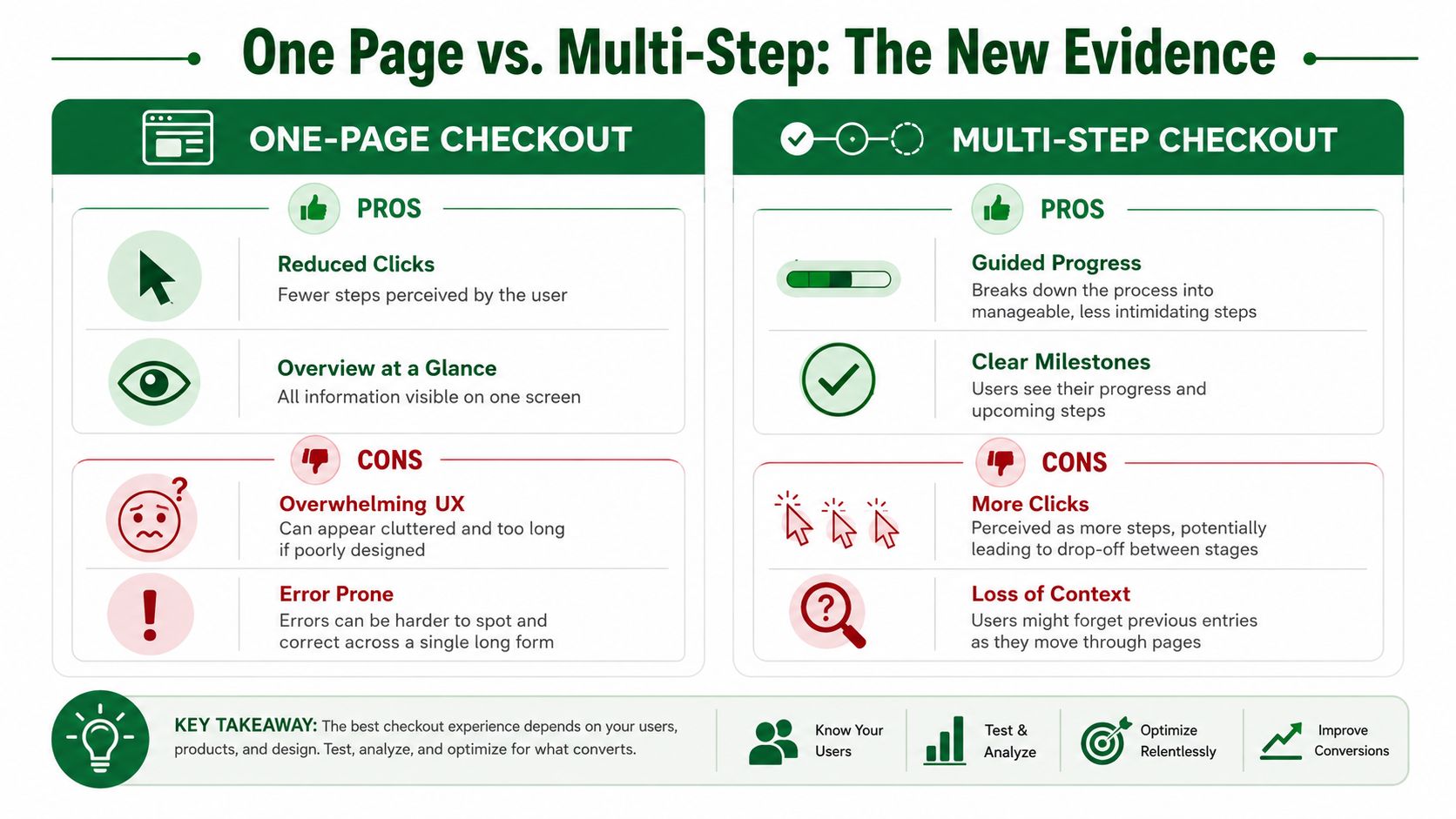
One Page vs Multi Step The New Evidence
The one-page versus multi-step argument has produced a lot of certainty and not much useful thinking. The old claim was that fewer clicks always wins. That's too simplistic for modern Shopify checkout.
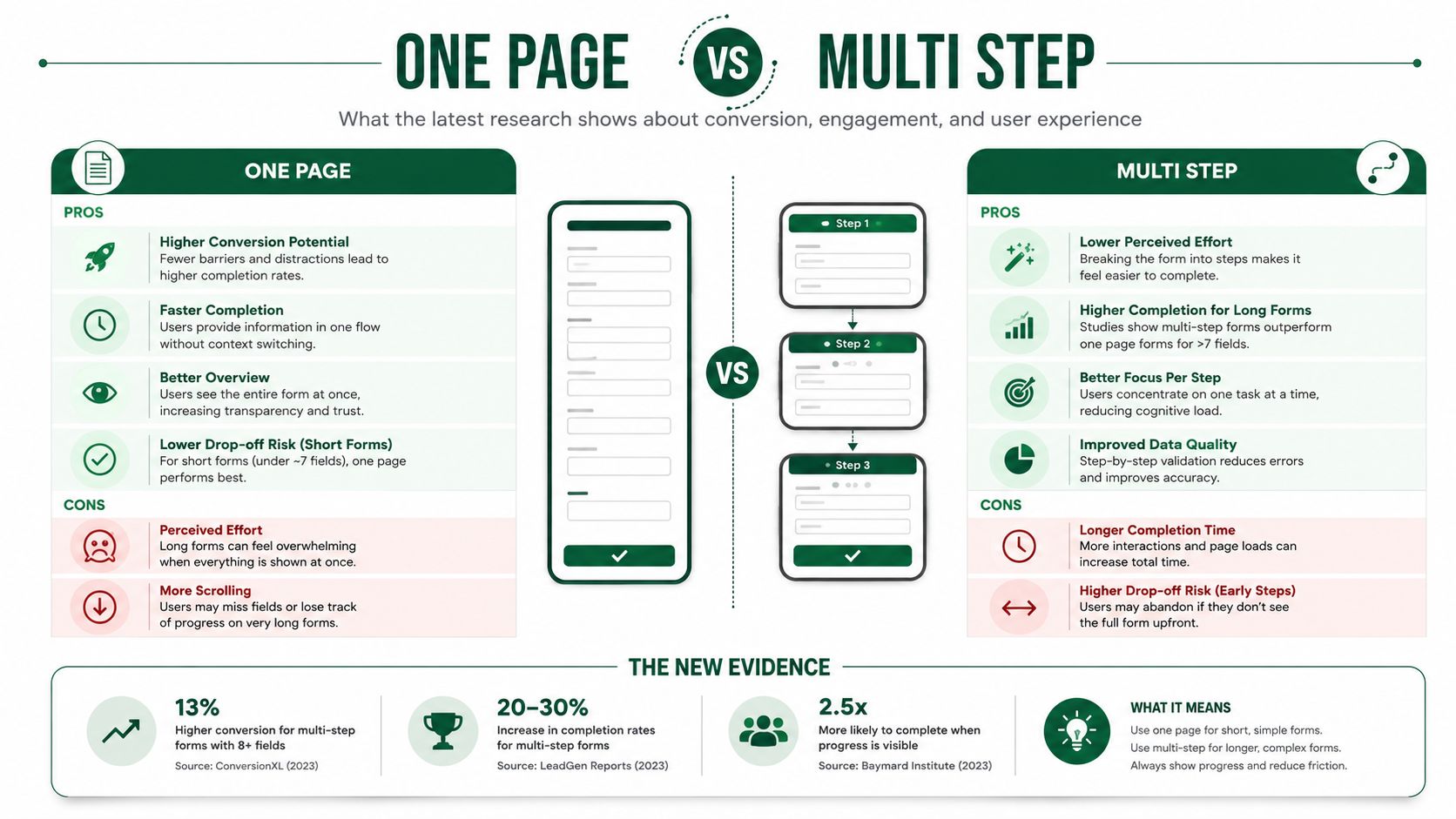
Why the old debate misses the point
A one-page layout can reduce perceived steps. It can also create a long, dense form that feels harder, especially on mobile. A multi-step flow can ask for more clicks while still feeling easier because it breaks the job into smaller decisions.
Shopify's current architecture makes the question less philosophical and more operational. What matters is whether the chosen layout reduces cognitive load for the specific customer and product model.
Some stores don't have a “one-page problem” or a “multi-step problem.” They have a field burden problem.
The strongest teams don't attach identity to either pattern. They evaluate whether the form feels short, whether errors are obvious, and whether progress is easy to understand.
How to decide what to test
The testing approach should be pragmatic:
Use one-page when the order is simple: fewer moving parts, fewer shipping complications, and a straightforward payment mix can suit a consolidated layout.
Prefer multi-step when the order has complexity: delivery choices, international rules, or heavier field requirements often benefit from guided progression.
Judge by device behavior: what feels efficient on desktop can feel exhausting on mobile.
The relevant Shopify capability here is draft iteration. Most plans can use multiple draft checkout configurations, and Plus has much deeper room for structured testing, as covered earlier. That makes it possible to evaluate layout choices without treating checkout redesign as an all-or-nothing release.
The mistake is picking a side based on old CRO folklore. The better move is testing the lowest-friction structure your store can support cleanly.
Custom Checkout Apps Worth Using
Friday afternoon. Conversion is soft, support is fielding payment complaints, and someone suggests adding another checkout app because a demo looked convincing. That is usually how teams make checkout worse.
The app layer inside Shopify checkout is much better than it was before checkout extensibility. There are now hundreds of apps built for the framework, which expands what serious operators can test without resorting to brittle workarounds, as Shopify notes in its Checkout Extensibility developer documentation. The constraint is still the same, though. Checkout is not a feature gallery. It is the highest-pressure step in the funnel, and every added element has to earn its place.
Use a problem-first rubric
A good checkout app solves one known problem with less friction than the problem itself creates.
That standard rules out a lot of apps. If the team cannot point to a specific issue, such as address errors, delivery uncertainty, or a payment-adjacent hesitation that the native setup does not handle well, the app probably does not belong in checkout.
App category | Worth considering when | Main trade-off |
|---|---|---|
Address validation | Address errors, carrier surcharges, or failed deliveries show up often enough to hurt margin and CX | More logic and UI during form completion |
Delivery date selection | Delivery timing affects conversion, gift purchases, or service expectations | Extra decisions can slow buyers down |
Post-purchase surveys | The team needs zero-party insight after the order is placed | Little direct effect on checkout completion |
Checkout upsells | The offer is tightly matched to the cart and easy to accept | Easy to distract from payment and hurt completion |
The trade-off is not theoretical. Every widget, message, and selector competes with the core job of getting the order through.
Categories that usually justify a closer look
Address tools are often worth testing first. They can reduce failed deliveries, manual support work, and carrier correction fees. The downside is obvious on mobile. If validation feels intrusive or forces too many corrections, conversion can drop before the operational savings show up.
Delivery communication is another category that can pay off. This matters most for stores where timing is part of the buying decision, such as gifts, perishables, pre-orders, or local delivery. A clear delivery selector or a precise date message can reduce hesitation. A cluttered shipping step can do the opposite.
Checkout upsells need the highest bar. I have seen them work when the offer is low-priced, highly relevant, and presented with almost no effort required from the buyer. I have also seen them chip away at conversion because the team treated checkout like a product page extension.
There is also a vendor diligence issue here. Operators who want to pressure-test app decisions before rollout can use app store research, a platform that connects Shopify merchants with paid product research interviews with app developers and UX teams. Used well, it gives teams a direct way to question roadmap fit, implementation trade-offs, and whether an app is solving a real checkout problem before it spreads across the stack.
One caution from experience. Case studies about checkout apps are directionally useful, but they are rarely portable. A gain on a high-intent repeat-purchase brand will not necessarily transfer to a first-purchase mobile-heavy store with a broader SKU mix.
Use apps to remove friction you can already describe. Do not add them because the pitch promises more revenue in the abstract.
Measurement Checkout Funnel Analytics
Checkout opinions are cheap. Funnel evidence is what matters.
A practical workflow is to instrument the funnel in Shopify Analytics and GA4 first, then test the highest-friction variables in order. Shopify community guidance specifically points teams toward Analytics reports, abandoned checkout reporting, and GA4 funnel exploration to isolate step-level drop-off before making changes, as explained in this Shopify Community discussion on optimizing checkout for conversions.
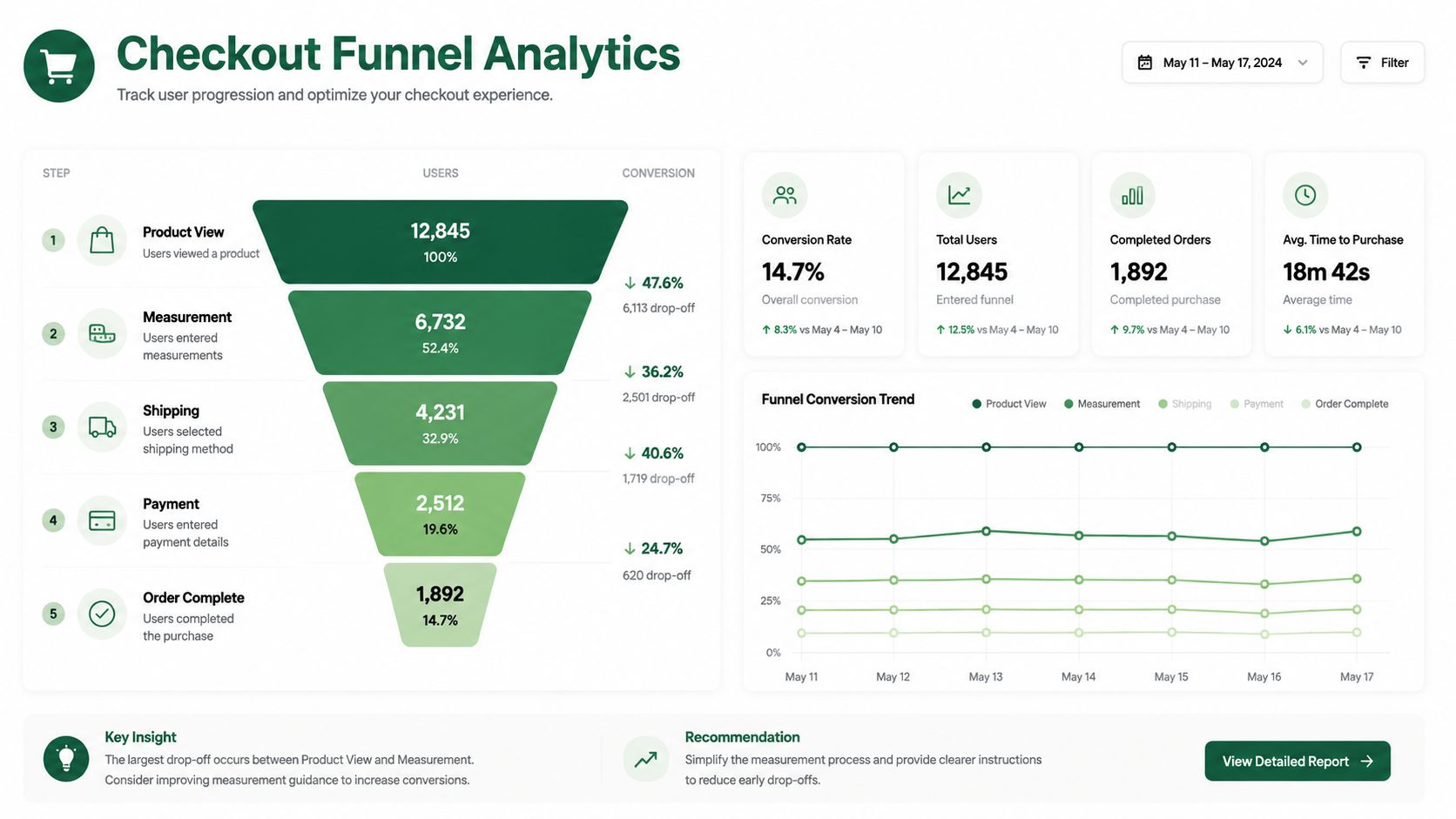
A practical diagnostic workflow
The sequence matters.
Map the funnel by step: information, shipping, payment, and completion.
Segment by device: mobile and desktop usually reveal different friction patterns.
Review abandonment reports alongside GA4: Shopify shows store-native behavior, while GA4 helps with broader session and source context.
Form one hypothesis at a time: for example, cost visibility, form burden, or payment hesitation.
What teams usually miss
Many teams only look at top-line conversion and miss where the problem starts. That leads to random fixes.
Diagnose the exact step before changing the experience. Checkout optimization done without step-level evidence is mostly guesswork.
Hidden costs remain a recurring source of drop-off, so measurement should confirm where that concern surfaces. If the shipping step collapses on mobile, the fix probably isn't stronger branding. It's likely clarity, simplification, or both.
Influence the Tools You Use Every Day
A familiar checkout problem looks like this. Your team knows an app is adding friction, the workaround is ugly, and the feature request has been sitting in a vendor queue for months. That is normal in the Shopify app market, especially now that checkout changes have to fit inside extensibility instead of old checkout.liquid habits.
Serious operators should not treat app vendors as black boxes. The teams that get better tools usually create direct feedback loops with product teams, explain the use case in commercial terms, and push for changes that fit real checkout constraints. That is part of optimization now. If a checkout app affects speed, trust, or payment completion, the product roadmap matters.
app store research is built around that reality. It connects Shopify operators with founders and product teams through paid research conversations, which is more useful than another generic demo or support thread that goes nowhere. For teams reviewing the stack more broadly, this guide to Shopify app stack optimization is worth reading alongside checkout work.
Within that network, many operators are already running larger Shopify setups, including Plus stores. That makes the feedback loop more relevant for teams dealing with extensibility limits, app overlap, and the usual trade-off between shipping a workaround now or waiting for a cleaner product fix.
The best operators do not join these conversations for the incentive alone. They join because direct access to app founders can change product priorities, shorten bad implementation cycles, and help them avoid carrying weak tools for another quarter. If that kind of access is useful, join the network.

Author
Jonathan Kennedy
Jonathan Kennedy is the founder of app store research and shopexperts, platforms that connect operators, founders, and experts across the Shopify ecosystem to drive better decisions, product development, and growth.