How to Reduce Cart Abandonment: Shopify Guide 2026
/
Most content on how to reduce cart abandonment points teams at the wrong target. Abandonment is an outcome. The work that changes it happens earlier, inside the decisions that create checkout friction in the first place.
I see the same pattern across Shopify stores. Teams obsess over recovery emails, popup offers, and last-minute discounts while critical leaks sit in plain view. Shipping costs show up too late. Checkout asks for unnecessary effort. Payment methods do not fit buyer intent. Mobile checkout feels slow or unstable at the point where trust matters most.
Baymard-backed benchmark data, as cited earlier, puts average cart abandonment at 70.19% and underscores how much revenue is left behind when those frictions go unresolved. That number is useful as context, not as a goal.
Operators do not need another generic list of tactics. They need a way to diagnose why shoppers exit, which causes deserve attention first, and which fixes are worth implementing on Shopify. That is the focus here.
Table of Contents
Why 'Reduce Abandonment' Is the Wrong Framing
Abandonment is a lagging metric
What the benchmark is useful for
The Five Actual Causes and Their Real Impact
Unexpected costs
Forced account creation
Payment insecurity or weak payment choice
Long or complicated checkout
Poor mobile experience
Shipping Cost Transparency
Show the economics earlier
Reduce surprise instead of bribing the shopper
Account Creation Friction
Guest checkout should be the default
Use accelerated checkout to keep repeatability
Payment Options and Trust Signals
Payment flexibility removes hesitation
Trust signals need to support the payment moment
The blind spot in recovery flows
Mobile Checkout Speed
Technical causes of mobile friction
UX fixes that matter on small screens
Recovery as the Last Line of Defense Not the Strategy
What recovery can do
What recovery cannot fix
From Fixing Your Funnel to Influencing the Tools
Why 'Reduce Abandonment' Is the Wrong Framing
“Reduce cart abandonment” sounds like a sensible goal. In practice, it pushes teams toward the wrong work. It turns attention toward a headline percentage instead of the specific points of friction that make a shopper pause, hesitate, or leave.
That distinction matters because abandonment is an output metric. It shows that something went wrong, but it does not tell you what.
Abandonment is a lagging metric
A shopper does not abandon because the cart exists. They leave because the purchase stopped feeling easy, clear, or safe enough to finish. I see this pattern across Shopify stores in very different categories. Two brands can sell similar products at similar price points and still get very different checkout performance because one removes friction early and the other lets it pile up until the final step.

Benchmarks are useful for context. As noted earlier, average abandonment rates are high across ecommerce. That does not mean every store is broken. It means checkout is where hidden friction becomes expensive.
Practical rule: Treat cart abandonment as a readout, not a root cause.
What the benchmark is useful for
Use the benchmark to spot whether you likely have a meaningful checkout problem. Do not use it as the goal itself. The better question is not “How do we lower abandonment?” The better question is “Where is the buyer losing confidence or momentum?”
That shift changes priorities fast. Teams stop treating recovery emails as the main fix and start diagnosing the mechanics of conversion: cost visibility, account requirements, payment fit, form effort, and mobile performance. Those are the levers that move checkout completion.
This is also how shoppers describe the problem when you talk to them. They usually do not say they “abandoned cart.” They say shipping showed up too late, checkout asked for too much, or payment did not feel trustworthy.
That is why this article focuses on causes, not the symptom. Lower abandonment is the result of fixing friction. It is rarely the result of chasing the metric directly.
The Five Actual Causes and Their Real Impact
Most abandonment problems fall into five buckets. None are abstract. Each one shows up directly inside Shopify checkout behavior.
Unexpected costs
This is the classic conversion leak. A customer builds intent on the product page, then sees shipping, taxes, or fees later than expected. The issue isn't only price. It's trust. Late cost disclosure makes the store feel less credible, even if the final total is reasonable.
Forced account creation
This one still shows up far too often. Teams think requiring an account helps retention or CRM quality. In practice, it often creates a speed bump for first-time buyers who just want to complete a purchase.
Payment insecurity or weak payment choice
“Can I pay how I want?” and “Do I trust this checkout?” are tightly connected. If the preferred payment method isn't available, or if the page doesn't look credible, hesitation shows up fast.
Long or complicated checkout
Checkout length is rarely about the number of screens alone. It's about perceived effort. Too many fields, unclear progress, weak autofill, and unnecessary decisions all make the purchase feel heavier than it should.
Poor mobile experience
Mobile is where small usability problems become expensive. Tight spacing, slow rendering, keyboard jumps, broken autofill, and lag between steps all create friction right at the moment of highest intent.
A simple diagnostic view helps prioritize:
Cause | What the shopper feels | What the operator should inspect first |
|---|---|---|
Unexpected costs | “The final price changed” | Cart page pricing visibility, shipping estimator, delivery messaging |
Forced account creation | “This is taking longer than it should” | Guest checkout settings, login gating, Shop Pay visibility |
Payment issues | “I can't pay my way” or “This feels risky” | Wallet coverage, BNPL availability, payment logo placement |
Long checkout | “Too much work for one order” | Form field count, progress indicators, autofill support |
Mobile friction | “This is annoying on my phone” | Theme speed, app scripts, tap targets, wallet buttons |
The highest-performing teams don't debate whether abandonment is “normal.” They isolate the step where confidence drops and fix that step first.
Shipping Cost Transparency
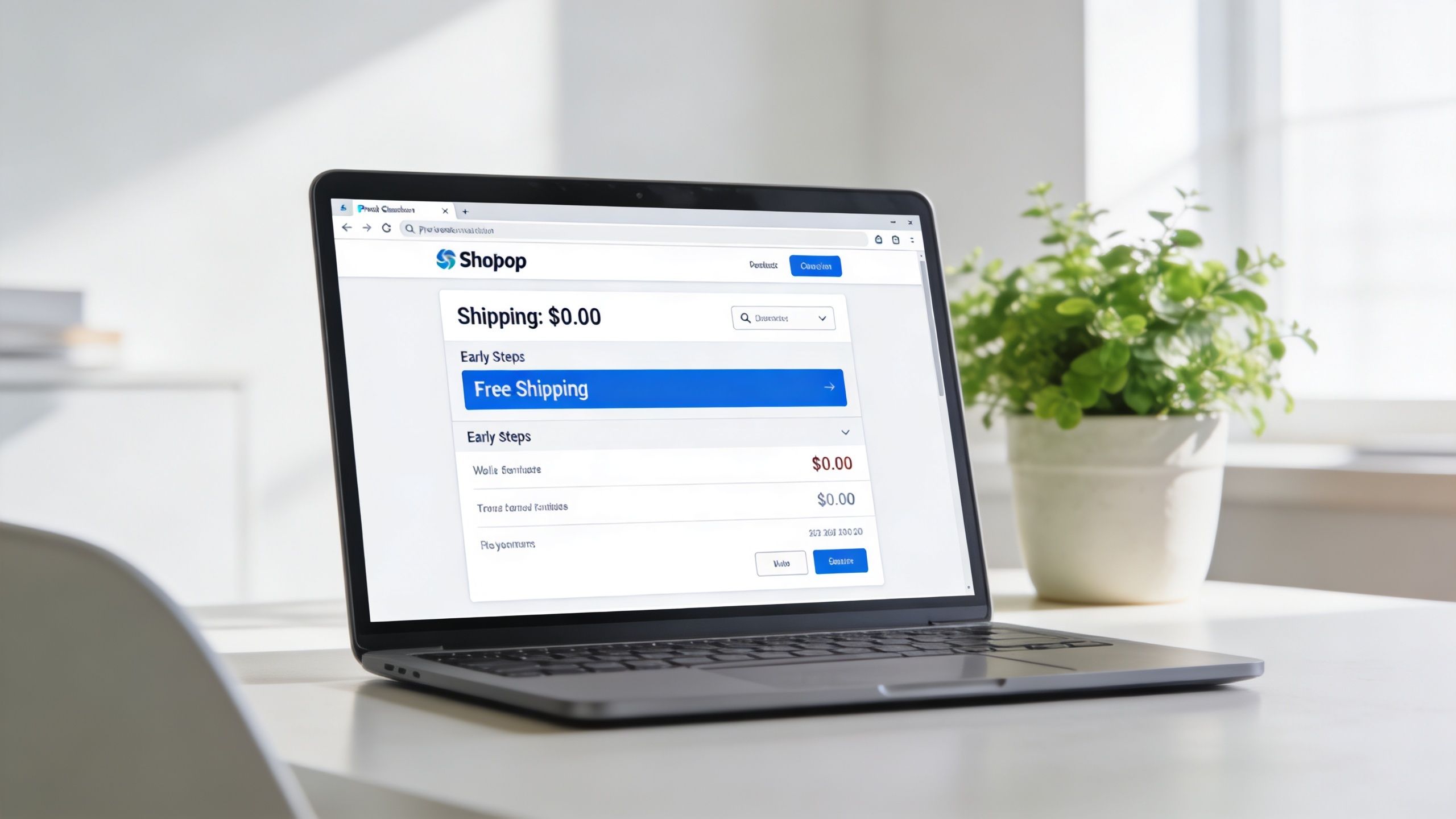
Unexpected shipping is still one of the fastest ways to lose a high-intent shopper. The fix isn't always free shipping. The fix is usually earlier clarity.
Show the economics earlier
A serious store doesn't wait until the last step to reveal the cost structure. Shipping thresholds should appear on product pages, in-cart messaging, and announcement bars where relevant. If free shipping starts above a certain threshold, that threshold should be visible before checkout begins.
For merchants working through margin pressure and carrier complexity, Snappycrate's shipping cost reduction guide is a useful operational companion because it focuses on the shipping-side decisions behind what the customer eventually sees.
Reduce surprise instead of bribing the shopper
Three tactics usually do more than blanket discounting:
Use a clear free shipping threshold. This reduces uncertainty and can lift average order value without training customers to wait for coupons.
Add an in-cart shipping calculator. If rates vary by geography or fulfillment rules, estimate them before the checkout step where commitment should happen.
Show delivery timing with the cost. Price without timing creates another question. A rate paired with an expected delivery window feels more concrete.
Stores often think they have a pricing problem when they actually have a timing and visibility problem.
Shipping communication also needs consistency. If the PDP promises one thing, the cart suggests another, and checkout introduces a third version, the customer notices. The conversion loss comes from contradiction as much as from price.
Account Creation Friction
Forced account creation is one of the easiest checkout mistakes to fix, and one of the most stubborn. Teams keep it because they value data capture. Customers experience it as delay.

Guest checkout should be the default
The case for guest checkout is straightforward. According to Glassbox's summary of shopping cart abandonment benchmarks, offering guest checkout can reduce checkout steps by 50% and boost conversions by as much as 35%.
That doesn't mean accounts have no value. It means the account should follow the order, not block it.
A useful reference for the operational trade-offs is Tagada's breakdown of checkout as guest benefits, especially for teams balancing conversion against post-purchase identity capture.
Use accelerated checkout to keep repeatability
The old argument against guest checkout was that repeat purchase behavior needed accounts. That's less convincing now. Shop Pay, Apple Pay, and Google Pay already give shoppers a much faster route back to purchase because identity, shipping details, and payment credentials are remembered securely.
A better pattern looks like this:
Checkout choice | What it does well | Where it fails |
|---|---|---|
Forced account | Captures identity early | Slows first purchase |
Guest checkout | Removes friction for new buyers | Needs post-purchase account invite |
Accelerated wallet checkout | Combines speed with repeat convenience | Requires strong placement and eligibility setup |
The strongest setup usually offers guest checkout by default, then uses post-purchase account creation prompts or accelerated methods for future orders. That preserves conversion now without giving up lifetime value later.
Payment Options and Trust Signals
Payment friction shows up late, but the cause usually starts earlier. By the time a shopper reaches checkout, they are asking two questions fast: can I pay the way I want, and do I trust this store enough to hand over my details?

Payment flexibility removes hesitation
For many Shopify stores, payment method coverage is a bigger issue than teams expect. Standard card entry is rarely enough if the store sells on mobile, sells internationally, or has a higher average order value. Wallets reduce typing. BNPL can reduce upfront cost anxiety. PayPal still matters for shoppers who want a buffer between themselves and the merchant.
The goal is not to pile on every option available. Too many payment choices can create noise, complicate reconciliation, and introduce edge-case failures in checkout. The better approach is to match methods to buyer behavior. If a store skews mobile, prioritize Apple Pay and Google Pay. If average order value is high, test BNPL. If cross-border demand is meaningful, make sure local payment expectations are covered.
Stores selling downloads, memberships, or mixed carts run into this sooner because hesitation tends to show up right before payment. Some of the same patterns appear in Suby's step-by-step digital product sales guide, especially around reducing doubt before the customer commits.
Trust starts before checkout too. Product reviews, ratings, and visible proof of prior buyers do more than help PDP conversion. They lower skepticism at the payment step. That is one reason operators often compare Shopify review app options for trust-building across the funnel before they touch checkout customization.
Trust signals need to support the payment moment
Placement matters more than volume.
Payment logos help near the CTA and in the payment section because they answer a live question. Security copy helps when it is specific and restrained. A clean line about encrypted checkout can calm a hesitant shopper. A stack of generic badges, popups, and icons usually does the opposite. It looks like compensation for weak credibility.
For Shopify Plus teams using checkout customization, Shopify's checkout extensibility documentation is the right starting point for understanding what can be changed safely inside checkout.
A visible payment method can reduce uncertainty. A cluttered wall of badges can increase it.
The blind spot in recovery flows
Recovery emails and SMS often reuse the same message for everyone, even though payment objections differ by segment. A shopper who dropped off because they did not see PayPal needs a different reminder than one who hesitated on price and would respond better to BNPL messaging.
That is why "reduce abandonment" is weak framing here. The job is to diagnose the failed payment moment, then reflect that diagnosis in both checkout and recovery. Fullstory's cart abandonment guidance points to this broader behavior problem, and it matches what operators see in practice. Generic reminders recover some revenue. Segmenting by likely payment friction usually recovers more.
Mobile Checkout Speed
Mobile checkout speed gets misdiagnosed all the time.
Teams look at cart abandonment, send another recovery flow, and miss the simpler problem: the checkout experience is slow, fragile, and harder to complete on a phone than it is on a laptop. If the page lags, fields jump, or wallets load late, shoppers are not "abandoning." They are hitting avoidable friction.
Technical causes of mobile friction
On Shopify stores, the slowdown usually comes from the layer around checkout, not one dramatic bug. It is the accumulation of theme edits, tracking scripts, upsell widgets, review apps, chat tools, and personalization tools. Each one can look reasonable on its own. Together, they add weight, delay interactions, and create layout instability on mobile.
The common failure points are predictable:
Unoptimized assets. Large images, custom fonts, and heavy third-party files slow the pages that lead into checkout.
App script overload. Extra JavaScript from multiple apps increases load time and can delay taps, field focus, and wallet rendering.
Theme and template drift. Stores with years of incremental edits often carry old code that no one wants to touch, even when it is hurting conversion.
This is why app governance matters. Teams cleaning up bloat should regularly review their Shopify app stack optimization decisions, especially after adding new tools and seeing mobile conversion soften.
UX fixes that matter on small screens
Raw page speed matters. So does effort.
A fast mobile checkout can still underperform if it forces too much typing, hides the next step, or makes people correct basic errors with their thumbs. On a phone, every extra interaction carries more cost.
The fixes that tend to move conversion are straightforward:
Show accelerated wallets early. Apple Pay and Google Pay cut form entry and shorten the highest-friction part of the journey.
Support autofill cleanly. Address and payment autofill only help when fields are configured properly and error handling is clear.
Make the form easy to tap. Larger tap targets, consistent spacing, and fewer stacked distractions reduce input mistakes.
Keep progress obvious. Shoppers should know how many steps remain and whether they are close to payment or still stuck in data entry.
Baymard's research has shown for years that checkout usability issues are a major source of drop-off. On mobile, those issues get amplified because the screen is smaller, the connection is less reliable, and attention is easier to lose.
One practical trade-off is worth stating plainly. Merchants often add mobile overlays, sticky offers, cross-sells, and behavior-triggered apps because each promises a lift. In isolation, some do help. In aggregate, they often slow the path to purchase and suppress checkout starts. For stores with meaningful mobile traffic, protecting checkout speed usually produces more profit than squeezing in one more promotional layer.
Recovery as the Last Line of Defense Not the Strategy
Abandoned cart recovery matters. It just shouldn't carry the whole burden of conversion.
What recovery can do
Standard abandoned cart flows recover 10% to 15% of carts, while advanced AI-personalized flows can achieve 20% to 30% recovery, according to Klaviyo's guidance on reducing cart abandonment. The better programs segment by cart value, use dynamic content based on the actual items left behind, and optimize timing and channel, typically email first and SMS second.
That level of sophistication is why generic “one reminder email” playbooks underperform. Strong recovery requires logic, creative variation, and restraint around discounting.
A merchant evaluating SMS as part of that stack should look at the best SMS marketing apps for Shopify through the lens of segmentation and timing, not just send volume.
What recovery cannot fix
Recovery doesn't fix a checkout that feels unreliable. It doesn't erase late shipping shock. It doesn't make a forced account step feel acceptable in hindsight.
Recovery is the bucket under the leak. It is not the pipe repair.
The sequence for operators should be clear:
Fix the checkout causes first
Then build recovery flows that match cart value and buyer intent
Then test message timing and channel mix
If a store starts with email and SMS while leaving core friction in place, it's paying to chase avoidable exits.
From Fixing Your Funnel to Influencing the Tools
A serious operator doesn't chase symptoms. The work is diagnosing friction, ranking causes, and fixing what changes buyer behavior.
That expertise has value beyond one store. The people building Shopify apps need direct feedback from operators who know where checkout breaks, which trust signals matter, and what features are still missing. That's especially true in crowded categories where app teams are guessing at merchant pain instead of hearing it directly.
App Store Research is a platform that connects Shopify merchants with paid product research interviews with app developers and UX teams. It's useful for operators who want direct access to founders and product teams, influence over app roadmaps, and earlier visibility into what's being built across the ecosystem. The compensation matters, but the bigger value is an advantage in conversations with the vendors shaping the stack.
The strongest Shopify operators don't just adapt to the tools available to them. They influence the tools that get built next. If that kind of access is valuable, join the network to take part in paid conversations with the app founders and product teams building the software used every day.

Author
Jonathan Kennedy
Jonathan Kennedy is the founder of app store research and shopexperts, platforms that connect operators, founders, and experts across the Shopify ecosystem to drive better decisions, product development, and growth.