Ecommerce Conversion Rate Benchmarks: 2026 Operator Guide
/

A Shopify operator opens analytics, sees a 2.1% conversion rate, and immediately asks the wrong question.
Not “is that up from last week?” Not “which channel is dragging it down?” Not “does mobile convert badly because checkout friction is still unresolved?”
The usual question is simpler and less useful. Is 2.1% good?
That's where most benchmarking advice falls apart. A single blended number hides too much. A food brand, a skincare subscription, an apparel store with heavy paid social, and a high-ticket considered-purchase brand can all post the same sitewide conversion rate and have completely different underlying performance.
Useful ecommerce conversion rate benchmarks need context. Category matters. Device matters. Store maturity matters. Traffic intent matters. Without that context, benchmarks turn into vanity comparisons.
Table of Contents
Methodology How These Benchmarks Are Assembled
Why blended averages break down fast
What went into these benchmarks
How we handled confidence and gaps
Overall Ecommerce Conversion Benchmarks for 2026
Conversion Benchmarks by Ecommerce Category
2026 conversion rate benchmarks by category
Conversion Benchmarks by GMV Tier
What changes as brands scale
Where teams usually focus at each stage
Conversion Benchmarks by Traffic Source
Intent matters more than volume
A better way to judge channel performance
Conversion Benchmarks by Device
The mobile gap is still real
What usually hurts mobile conversion
How to Use Benchmarks Without Misleading Yourself
Use benchmarks for context, not ego
A practical operating rhythm
Gain Influence Over The Tools You Use Daily
Methodology How These Benchmarks Are Assembled
A $5M apparel brand at 2.4% conversion and a $500K supplements brand at 2.4% are not in the same position. The headline number matches. The operating reality does not.
That gap is why this guide uses benchmarks as context for decision-making, not as a vanity metric. Conversion rate shifts with category, price point, traffic source, device mix, repeat purchase behavior, and how aggressively a brand buys cold traffic. Comparing unlike stores produces bad diagnosis and expensive fixes.
Why blended averages break down fast
Broad averages still have a job. They set a starting range. They do not tell an operator what to fix.
A store with heavy paid social traffic will usually convert differently from one driven by branded search or email. A mobile-first store with a fast repeat-purchase cycle should not be judged by the same standard as a desktop-heavy catalog with considered purchases. Geography, discount strategy, and returning-customer mix all change what "good" looks like.
The practical rule is simple: compare a store to its closest operating conditions.
What went into these benchmarks
The benchmark ranges in this article come from public datasets and published industry analysis already cited elsewhere in the guide. To avoid duplicate sourcing, those references are linked once and then referenced by dataset name in later sections. Where those sources provide hard numbers by category, device, or broad market performance, we use them.
The differentiator is the operator layer. It comes from aggregate patterns gathered across thousands of Shopify operator interviews, including merchants, agency leaders, app partners, and Plus teams. That layer does not pretend to be lab-grade measurement. It is useful for interpreting why two stores with similar topline conversion can have very different revenue outcomes, and for spotting recurring patterns public benchmark reports usually miss.
That matters because operators do not run businesses in one dimension. They run them across acquisition cost, margin, device mix, merchandising, and retention.
How we handled confidence and gaps
We separated quantified benchmarks from observed patterns. If a source set supported a numeric range, we used a number. If the source set did not support a clean number, we kept the guidance qualitative and said so plainly.
That trade-off is deliberate.
Fake precision is worse than a directional read, especially in benchmark content. It pushes teams to chase the wrong target, usually by forcing a blended conversion goal onto traffic, products, or devices that behave differently by design.
For a useful outside perspective on how practitioners frame conversion performance, see UFO Performance Marketing on conversion rates.
Methodology should help an operator make better calls. It should also show its work. This one does both by combining disclosed public benchmark inputs with pattern recognition from real Shopify teams, then keeping a hard line between measured data and informed interpretation.
Overall Ecommerce Conversion Benchmarks for 2026
A store can sit at 2.6% conversion, look fine on a dashboard, and still miss its revenue plan by a wide margin. I see this happen when teams benchmark against one blended average and ignore what that number hides: traffic quality, device mix, price point, and category economics.
The broad baseline still has value. Used correctly, it sets the floor for diagnosis.
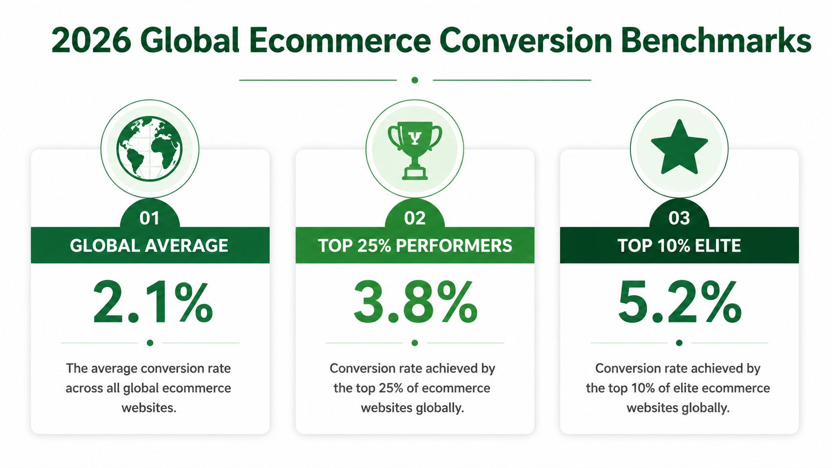
As noted earlier, the public benchmark set we used puts the global ecommerce average at 1.9% to 2%, while Shopify stores tend to land closer to 2.5% to 3%. That gap is useful because it prevents two common mistakes. One is panicking over a low-2% site without context. The other is treating a mid-2% Shopify conversion rate as proof the store is healthy.
The more useful framing is tiered performance.
The same benchmark dataset cited in the methodology shows top 20% stores at 3.2% and above, and top 10% stores at 4.7% and higher. For operators, that changes the question from "Are we average?" to "What has to improve to move up one tier, and will that improvement pay out in contribution margin?"
Performance tier | Conversion benchmark |
|---|---|
Global ecommerce average | 1.9% to 2% |
Typical Shopify range | 2.5% to 3% |
Top 20% of stores | 3.2% and above |
Top 10% of stores | 4.7% and higher |
Here is the trade-off teams miss. Moving from 1.8% to 2.6% often comes from fixing visible friction: page speed issues, weak PDP clarity, poor mobile UX, or checkout distractions. Moving from 2.8% to 4% is usually harder and more expensive. It often requires better traffic intent matching, stronger offer architecture, sharper merchandising, and tighter segmentation by source and device.
That is why this guide does not stop at one blended benchmark. The public numbers give the range. The operator interviews add the pattern recognition. Across thousands of Shopify conversations, the recurring lesson is simple: stores with similar sitewide conversion rates can produce very different revenue outcomes because their channel mix, average order value, and repeat rate are doing very different work.
Operators who want a wider practitioner view can review UFO Performance Marketing on conversion rates. Use the overall benchmark as a starting reference, then pressure-test it against the dimensions that move revenue.
Conversion Benchmarks by Ecommerce Category
Two stores can both convert at 2.4% and have completely different underlying performance. A refill-driven skincare brand may be underperforming at that level. A premium jewelry brand may be doing fine. Category sets the baseline because it changes purchase urgency, price sensitivity, trust requirements, and how much evaluation a shopper needs before buying.
That is why category benchmarks matter. They keep teams from chasing the wrong target.
Category benchmarking works only when the benchmark reflects how customers buy in that category.
As noted earlier in the methodology and source set, public benchmark studies show a wide spread by category. Personal care sits near the top in some datasets, while luxury and jewelry sits much lower. Triple Whale's category cuts point in the same direction even when the absolute numbers differ. The exact percentage matters less than the operating reality behind it: consumables and familiar products usually convert faster than high-consideration products.
2026 conversion rate benchmarks by category
Use the table below as a directional benchmark, not a quota.
Category | Average conversion rate |
|---|---|
Personal care | 6.8% |
Food and beverage | 4.9% |
Luxury and jewelry | 0.87% |
The spread is large for a reason. Personal care and food and beverage often benefit from repeat purchase behavior, lower perceived risk, and simpler decision-making. Luxury and jewelry usually face longer consideration cycles, higher price resistance, and stronger trust requirements before a shopper will convert.
I would pressure-test category performance through the specific frictions that drive revenue, not just the headline number:
Beauty and personal care: conversion usually rises or falls on offer clarity, subscription logic, bundle design, and PDP education.
Food and beverage: repeat intent, shipping thresholds, freshness cues, and pack-size merchandising often matter more than broad site redesigns.
Apparel: fit confidence, returns policy visibility, review quality, and mobile PDP usability tend to decide the session.
Considered-purchase categories: richer product detail, stronger social proof, financing visibility, and a longer retargeting window usually matter more than trying to force an immediate sale.
This is also where operator interviews add context that raw benchmark tables miss. Across thousands of Shopify conversations, the recurring pattern is simple: category averages are useful, but the biggest gains usually come from fixing the dominant source of hesitation in that category. Apparel teams often need to reduce uncertainty. Consumables teams often need to sharpen replenishment and AOV strategy. Higher-ticket brands usually need to build conviction before they ask for the sale.
Operators who want a second external reference can compare these ecommerce performance benchmarks from Wand Websites. Use category benchmarks to set realistic targets, then diagnose the specific buying friction that is suppressing conversion in your category.
Conversion Benchmarks by GMV Tier
GMV tier changes what a conversion problem is.

What changes as brands scale
Early-stage brands usually suffer from obvious trust and clarity gaps. The product pages don't answer enough questions. The landing pages feel stitched together. The app stack adds friction where it should remove it. In that environment, “benchmarking” often becomes a distraction from fixing the basics.
Larger brands run into a different problem. The store is cleaner, the traffic mix is broader, and the customer base is less uniform. A blended conversion rate can flatten meaningful differences between paid prospecting traffic, returning customer sessions, branded search, and campaign landers.
From aggregate operator interviews, a consistent pattern shows up across GMV tiers. Smaller teams usually need fewer opinions and better execution. Larger teams usually need tighter segmentation and sharper prioritization.
Where teams usually focus at each stage
A useful way to think about GMV tier is by operating constraint, not revenue bragging rights.
Earlier-stage brands usually need trust signals, better merchandising, cleaner PDP structure, and fewer unnecessary apps.
Mid-stage brands often get stuck between acquisition growth and site experience debt. Paid traffic exposes weaknesses that direct and branded traffic can hide.
More mature operators tend to focus on device-specific friction, merchandising depth, retention paths, and offer relevance by audience segment.
The benchmark that matters at each GMV tier is the one tied to the store's current bottleneck.
That's why serious teams don't ask only, “What's our conversion rate?” They ask, “What kind of traffic is this store designed to convert, and where does that design break?”
Conversion Benchmarks by Traffic Source
Traffic source benchmarks are useful only when the operator accounts for intent.
Intent matters more than volume
An email click and a paid social click shouldn't be judged by the same conversion expectation. One comes from an opted-in audience with prior familiarity. The other often arrives cold, interrupted, and only loosely qualified.
That's why source-level benchmarking needs restraint. The verified data for this article doesn't support precise by-channel percentages, so the right move is qualitative interpretation, not fake precision.
Email and SMS traffic usually sit closer to purchase intent. Organic traffic often lands somewhere in the middle, depending on query quality and landing-page match. Paid social tends to be the easiest source to over-credit for traffic volume and under-scrutinize for conversion quality.
For teams reviewing retention channels, this roundup of the best SMS marketing apps for Shopify is useful because channel performance is never just about traffic source. Execution inside the channel matters.
A better way to judge channel performance
The wrong way is to compare every channel to the sitewide average.
The better way is to ask:
Is this source sending the intent it promised?
Does the landing page match the message that got the click?
Is the offer built for a first visit or a returning buyer?
Does this traffic belong on a product page, collection page, or quiz-first path?
Operators who separate prospecting traffic from demand capture usually make better decisions faster. The benchmark becomes a decision aid, not a vanity target.
A paid channel can be healthy even when it converts below house average, if it creates profitable first purchases and feeds retention. An email channel can look strong while underperforming, if the list is engaged but the message is weak.
Conversion Benchmarks by Device
A store can look healthy in aggregate and still be leaking revenue on the device that carries most of its traffic. I see this constantly. Desktop props up the average, mobile does the volume, and the blended number hides the actual problem.

The mobile gap is still real
Across the public benchmark sets reviewed earlier, desktop still tends to convert better than mobile. Our aggregate observations from Shopify operator interviews point the same way. Mobile usually owns traffic share. Desktop often wins on completed purchases.
That gap matters because it changes what “below benchmark” means. A store with heavy mobile acquisition should not judge itself against a desktop-skewed experience. Device mix can distort the entire read on conversion quality, especially for brands buying a lot of paid social or creator traffic.
Tablet is the reminder not to overgeneralize. In some benchmark cuts, tablet conversion lands surprisingly close to desktop, or even ahead of it. The lesson is simple. Check your own split before assuming the issue is only “mobile users convert worse.”
What usually hurts mobile conversion
The pattern is rarely mysterious. Mobile sessions fail when the site forces too many taps, too much waiting, or too much interpretation.
Common causes show up fast:
Slow pages from heavy themes, third-party scripts, and oversized media
Weak PDP hierarchy where the first screen does not answer the buying question
Form friction that feels manageable on desktop and annoying on a phone
Payment friction when accelerated wallets are missing or unreliable
Merchandising clutter that adds scroll depth without helping the decision
I would treat speed and checkout first because they hit revenue fastest. Cosmetic homepage changes rarely close a device gap on their own.
The practical fix is operational, not inspirational. Audit what loads on mobile, cut apps that do not earn their keep, simplify the product page, and make checkout easier with the payment methods customers already expect. This is usually a stack problem as much as a design problem, which is why a review of Shopify app stack optimization often surfaces issues that a CRO dashboard misses.
A useful benchmark question is not “Is mobile below desktop?” It usually is. The better question is whether mobile conversion is low for your category, traffic mix, and price point, or low because the phone experience is making purchase harder than it needs to be.
How to Use Benchmarks Without Misleading Yourself
Benchmarks help most when they stop being emotional.
Use benchmarks for context, not ego
A benchmark is not a target. It's a reference point.
If a store compares its blended conversion rate to a generic market average, the team can easily chase the wrong fix. A low number might be normal for the category. A decent number might hide a weak mobile experience. A strong sitewide average might be carried by branded traffic while paid acquisition leaks margin.
That's why a store's own trend line matters more than a public benchmark. External numbers help frame the conversation. Internal segmentation tells the truth.
A practical next step is reviewing the broader stack, because conversion issues rarely live in one app or one page. This guide to Shopify app stack optimization is relevant here. A lot of conversion drag is really systems drag.
A practical operating rhythm
A serious operator can use ecommerce conversion rate benchmarks without getting trapped by them.
Start with category context
If the brand sells a considered purchase, don't benchmark it like a replenishable beauty product.Split by device before judging the store
Device mix can distort the entire story.Review traffic by intent class
Prospecting, branded demand, retention, and direct traffic shouldn't share the same success threshold.Look for the largest gap with the clearest operational cause
Slow mobile PDPs, weak trust signals, and bad message match are easier to act on than “sitewide CVR is low.”Track internal movement, not just market position
A benchmark tells a team where to look. Progress tells it whether the work is paying off.
The best operators use benchmarks to ask better questions. They don't use them to prove they're ahead of someone else.
Gain Influence Over The Tools You Use Daily
The operators with the most influence don't just benchmark performance. They affect the products that shape it.
App founders, product teams, and UX researchers need direct access to serious Shopify operators because dashboard data doesn't explain why a merchant hesitates, churns, or ignores a feature. Those answers usually show up in conversation. That's also why experienced brands often get a better outcome when they can speak directly with the people building their stack.
That access matters beyond conversion rate. It can lead to stronger vendor relationships, earlier visibility into upcoming products, and more credible feature requests when app costs rise and the marketplace gets noisy. For teams thinking about acquisition efficiency too, this roundup of Facebook ads conversion strategies is a useful companion read because acquisition and onsite conversion always meet in the same P&L.
For operators reviewing the broader stack they rely on every day, this piece on Shopify tech stack planning for ecommerce teams is a useful reference.
App Store Research is a platform that connects Shopify merchants with paid product research interviews with app developers and UX teams. The network includes over 3,000 operators and has paid out $1M in incentives. The point isn't casual side income. The point is access, influence, and a direct line to founders building tools that affect revenue every day.
Shopify operators who want more influence over app roadmaps, better access to founders, and paid conversations with the teams building their stack can join the network. The cash, typically $150–$250/hr, is the byproduct. Primary value comes from the advantage this access provides.

Author
Jonathan Kennedy
Jonathan Kennedy is the founder of app store research and shopexperts, platforms that connect operators, founders, and experts across the Shopify ecosystem to drive better decisions, product development, and growth.